Maison Escoffier
Brand ID Design
Maison Escoffier is a high-end pastry brand. The brand identity was developed for their new shop in Moka, Mauritius, with more locations to come. Maison Escoffier is the sister brand of Institut Escoffier, a trade school that specialises in luxury industry professions.
With its premium products and refined positioning, the brand needed a visual identity that would reflect the same level of craftsmanship and elegance. At the same time, the brand owners preferred a more classical and timeless design approach. This gave us an opportunity to embrace tradition while adding subtle creative flair.
Typography:
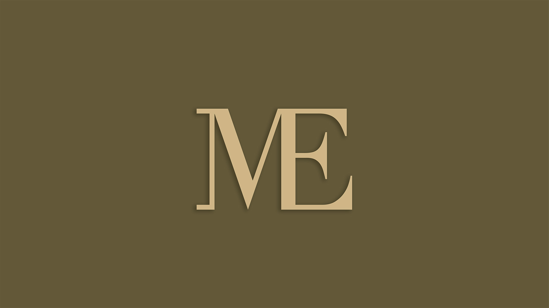
Didot was chosen for the logo. Clean and elegant, it brings a timeless sophistication. For the tagline, we used Parisienne, a delicate handwritten script that adds contrast and a sense of finesse.
Colour Palette:
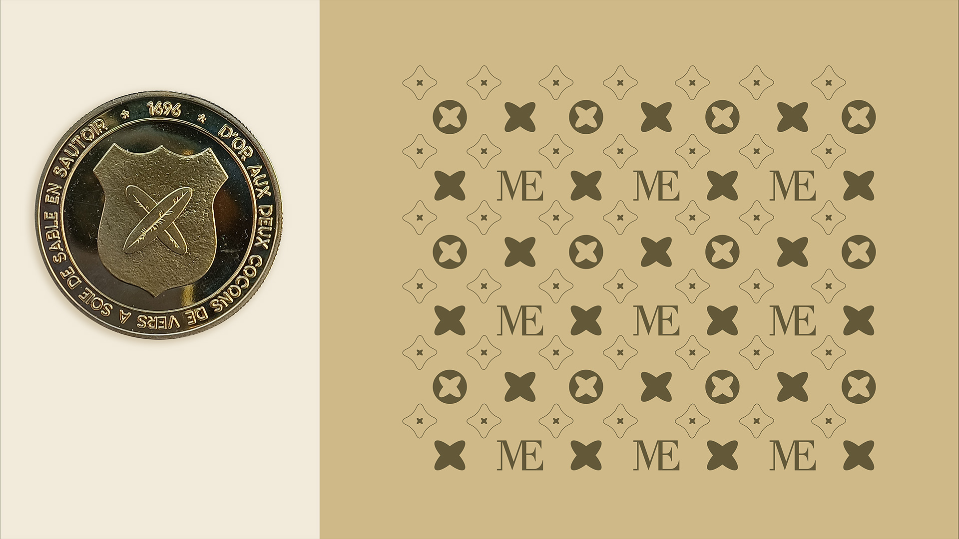
The warm, indulgent tones were inspired by champagne and chocolate. These colours evoke desire, luxury, and comfort, while also enhancing brand recognition through visual harmony.
Pattern Design:
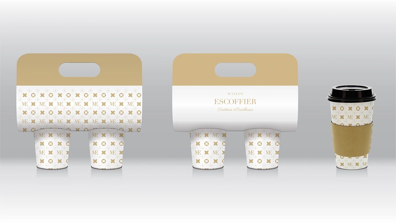
The pattern is inspired by the coat of arms of Villeneuve-Loubet, a town in southeastern France and the birthplace of Auguste Escoffier. The motif features two crossed silkworm cocoons, a reference to the town’s historical silk trade, and a subtle nod to heritage and refinement.
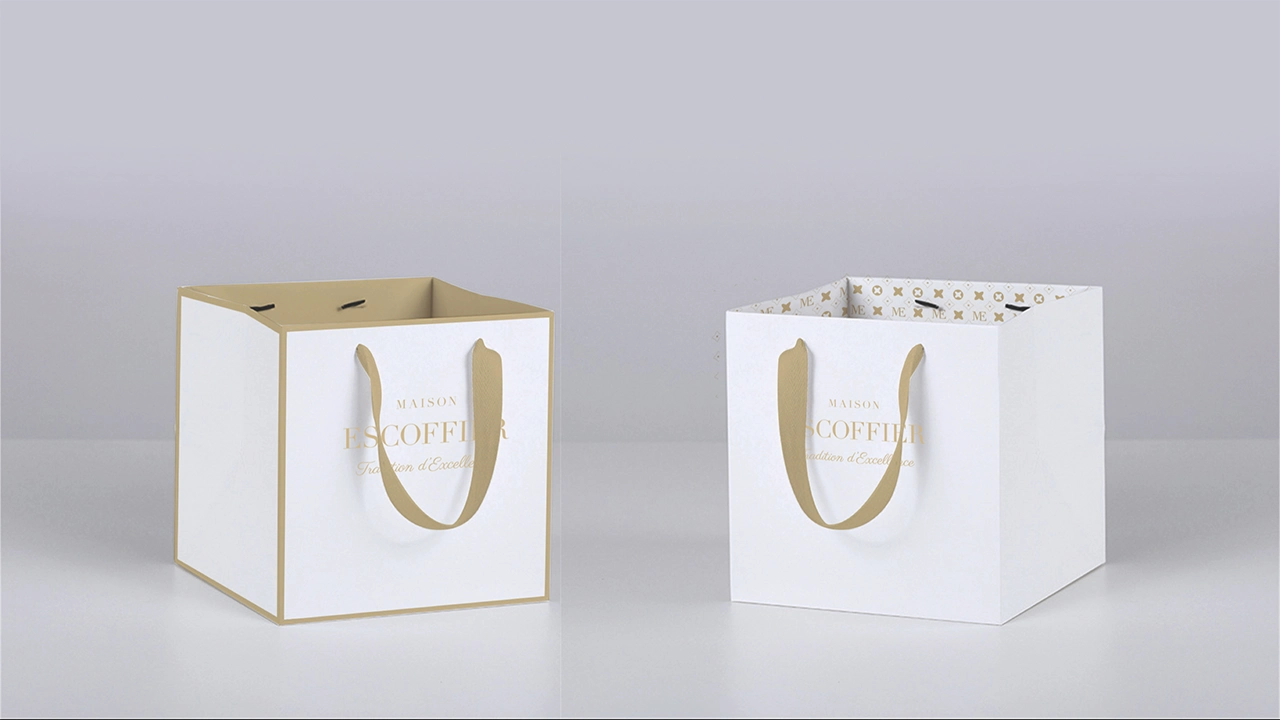
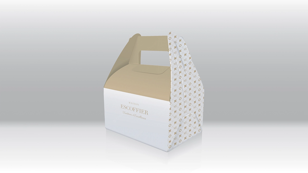
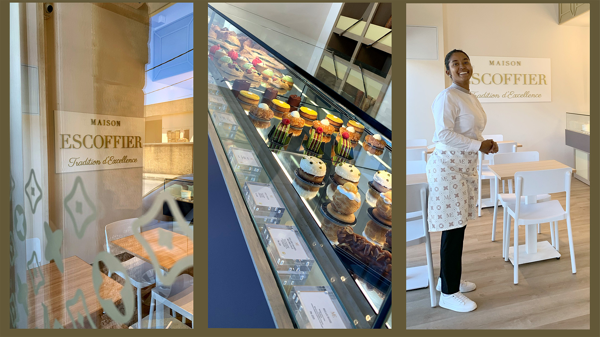
The visual identity of Maison Escoffier comes to life through packaging, uniforms, and interior design, ensuring a consistent and elevated customer experience across every touchpoint.