Karay Mario
Brand ID Design
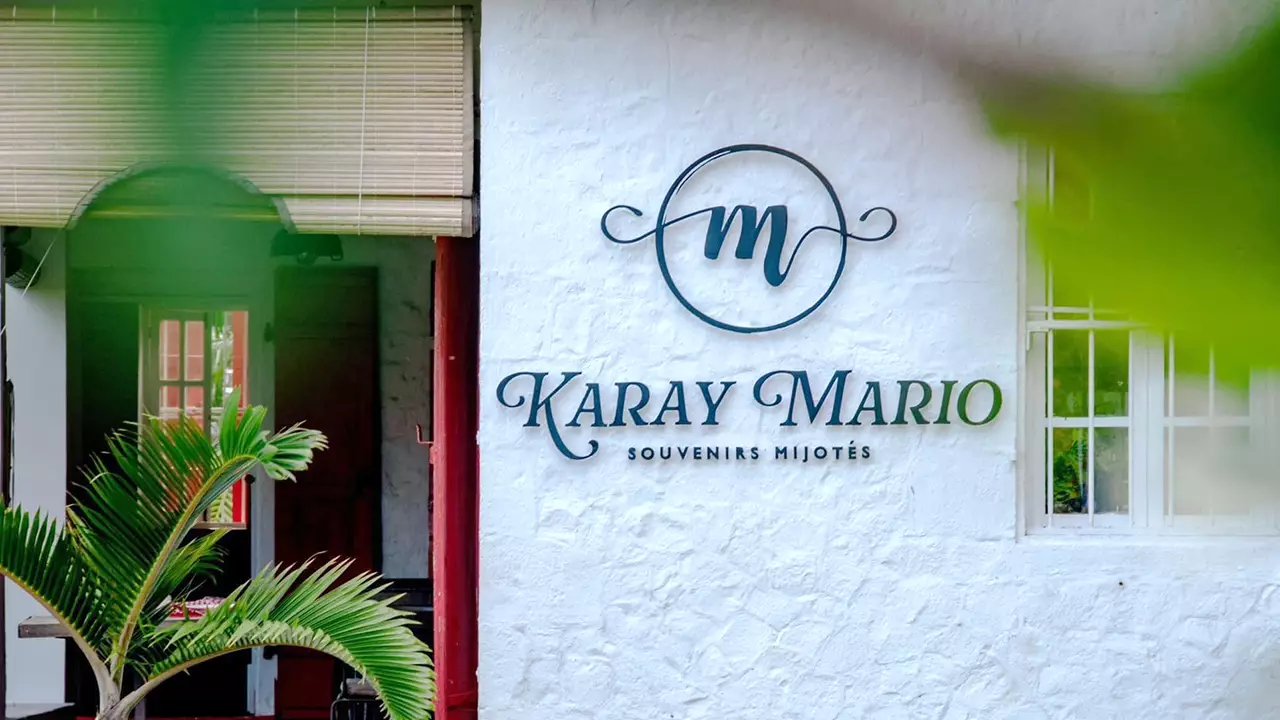
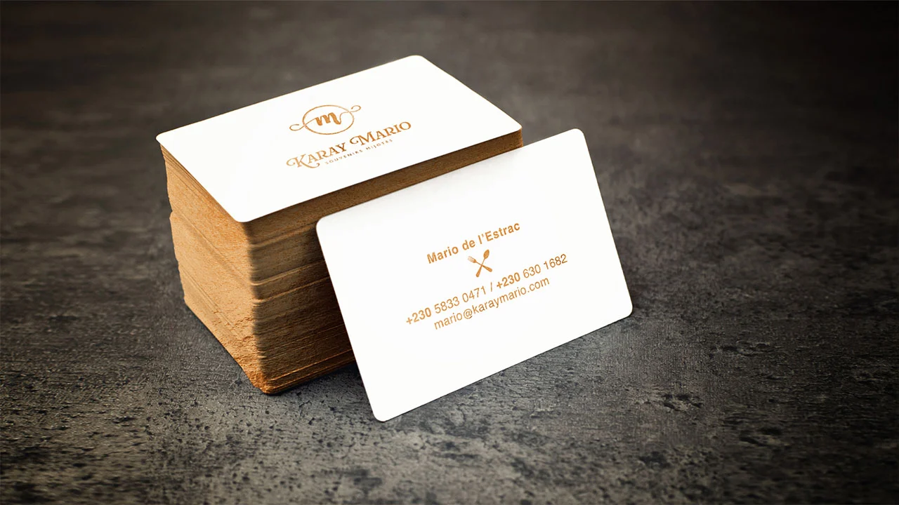
The branding for Karay Mario pays homage to both the personal journey of its founder and the soul of Mahébourg, the coastal town it calls home. The name itself evokes intimacy: karay (Creole for “pot”) paired with Mario, placing the chef at the heart of every dish and memory created. This personal connection is reflected in the elegant logotype and monogram, which subtly blend a sense of artisanal care with understated sophistication.
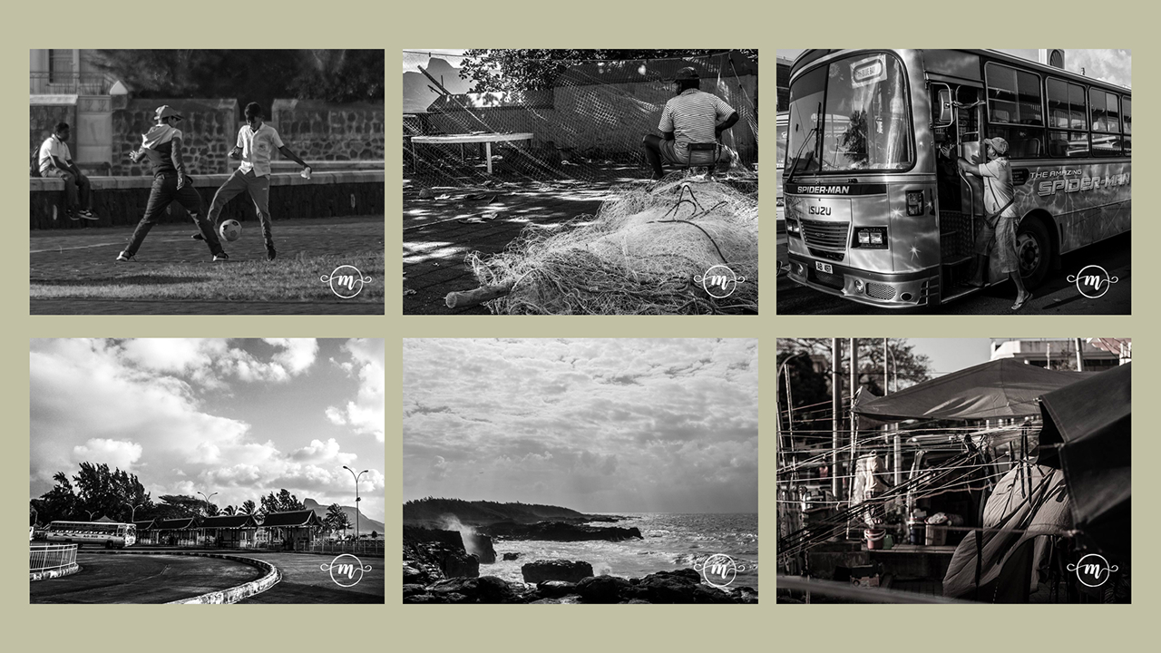
The design draws visual cues from Mahébourg’s nostalgic charm, a town suspended in time where cultures simmer together like the very dishes Karay Mario serves. The serif typography, paired with the swirled monogram and refined colour palette, evokes a bygone era while remaining firmly grounded in contemporary elegance. The visual identity thus echoes the restaurant’s culinary philosophy: traditional recipes, lovingly slow-cooked, but always with a modern touch.
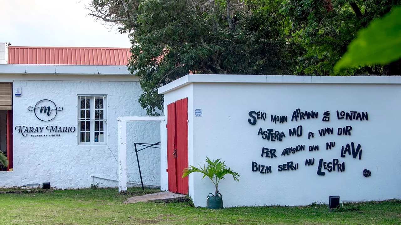
Every element, from the copper-toned business cards to the exterior signage, reinforces the brand’s positioning as a place where memories are “simmered” (souvenirs mijotés). The result is a timeless yet personal identity, rooted in authenticity and built to evolve with grace, just like Mahébourg itself.