JessKa
Brand ID Design
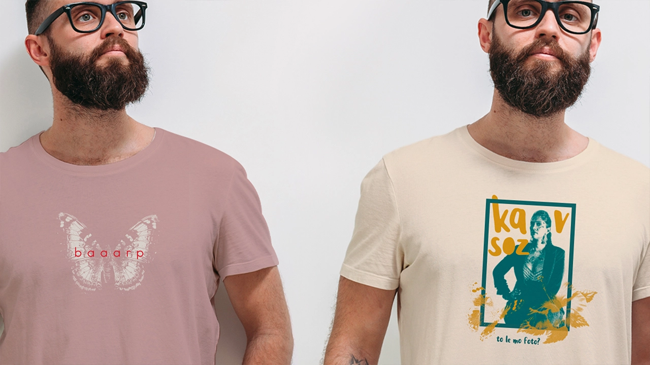
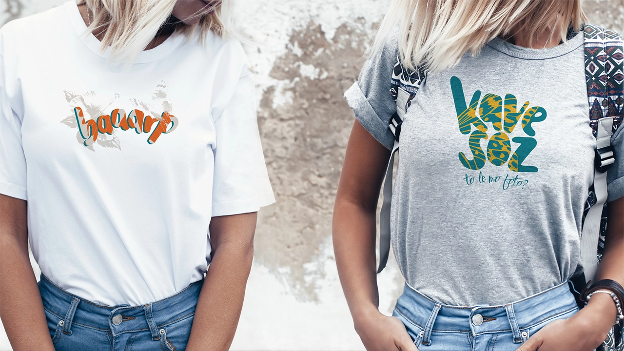
Every artist has a story. Jessica Gopaul-Vallet, aka JessKa, has one marked by emotional highs and lows. Like many who’ve been through the wringer, she emerges stronger, more inspired, and unapologetically herself. Much like a butterfly coming out of its cocoon, her music reflects that transformation – raw, vulnerable, but soaring with hope and strength.
The JessKa brand was designed to reflect this duality: bold yet approachable, powerful yet playful, grounded yet a little unpredictable.
Typography
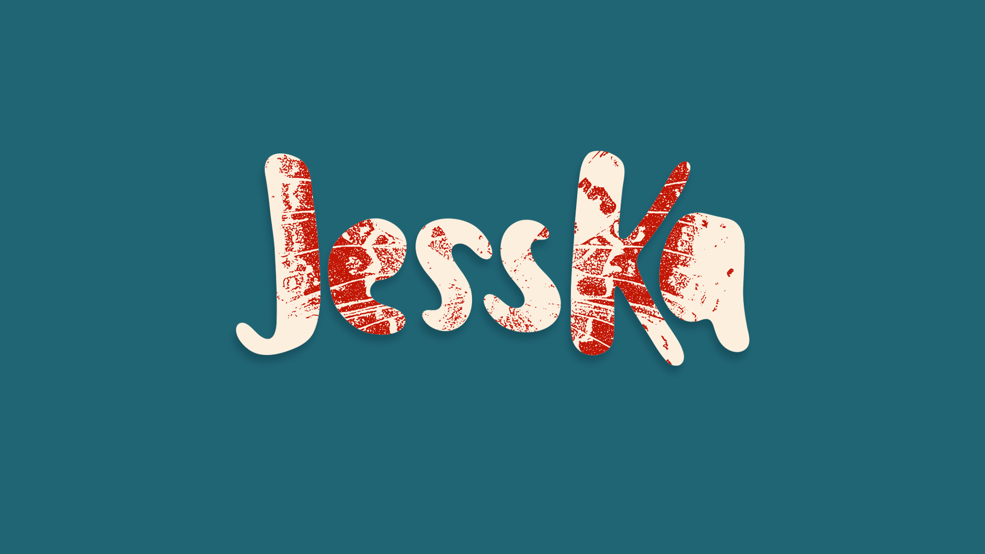
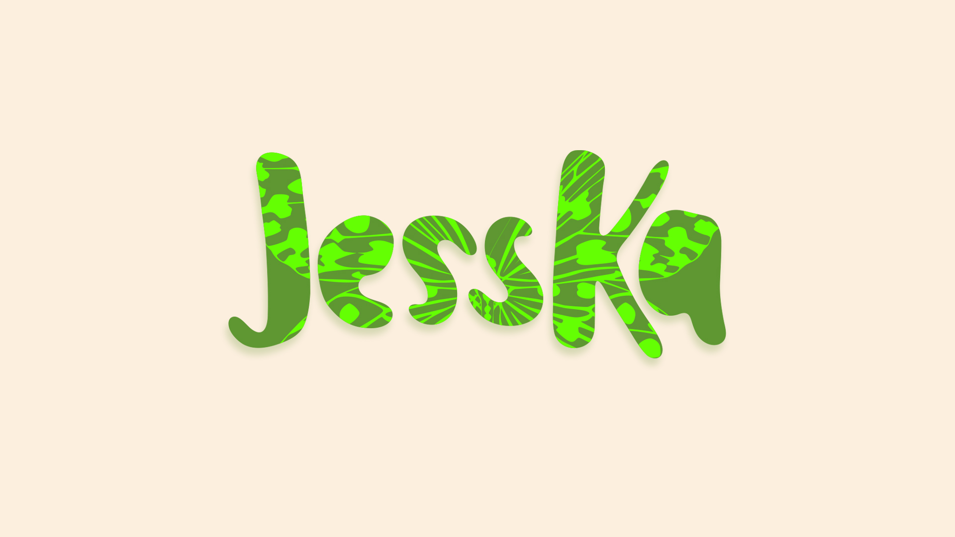
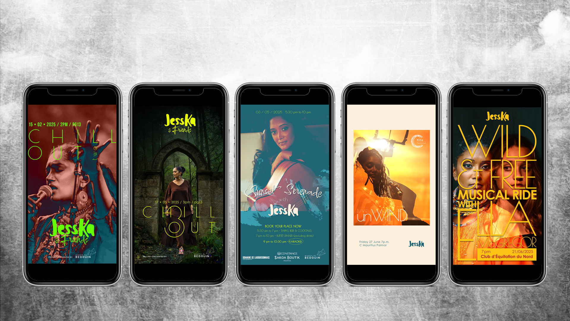
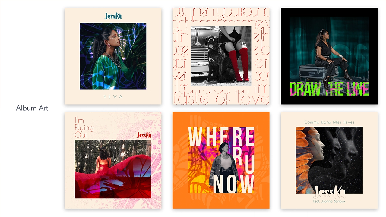
Three typefaces form the backbone of the visual identity. Leira is used for the main logo, sub-logos, and select merchandise designs, bringing a sense of organic form and unseriousness. Poiret One adds a clean, expressive flair to headlines and titles. Century Gothic handles general text usage, from emails to captions, maintaining clarity and simplicity.
Colour Palette
The colour scheme, affectionately named Spice n’ Pop, is a vibrant blend of Mauritian spice tones paired with pops of neon pink, green, and yellow. The combination captures JessKa’s roots while expressing her energy and playful personality.
Pattern Design
Butterfly wings serve as the brand’s key graphic motif. With personal significance to JessKa (don’t ask), these patterns reinforce the theme of transformation and identity, becoming a subtle but meaningful design signature.
The final logo captures her essence: bold, warm, and just a little bit crazy.