G+F Associates
Brand ID Design
The rebrand of G+F Associates, a Mauritian architectural agency, is rooted in the principles of the Bauhaus movement, where form serves function and beauty comes from clarity and intention. This philosophy guided the creation of a visual identity that is precise, modular, and architecturally inspired.
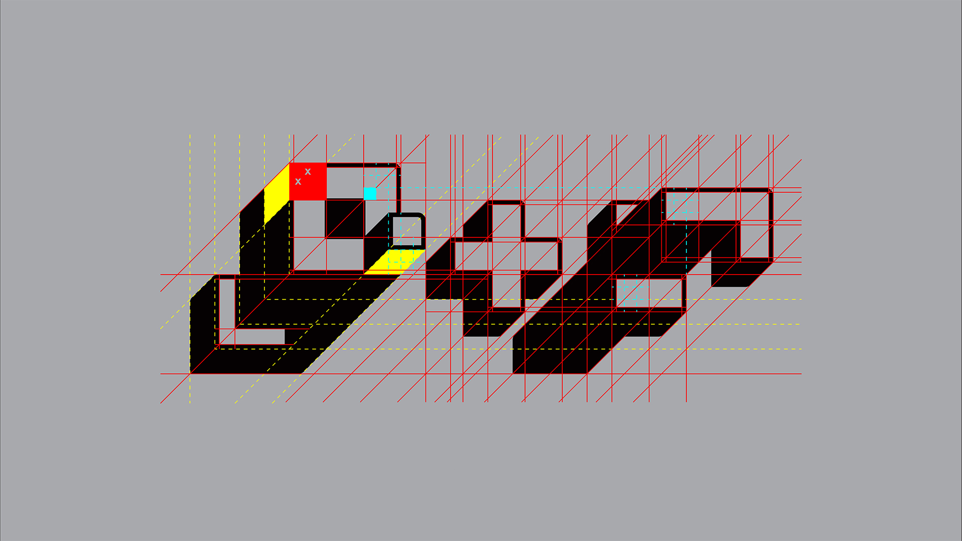
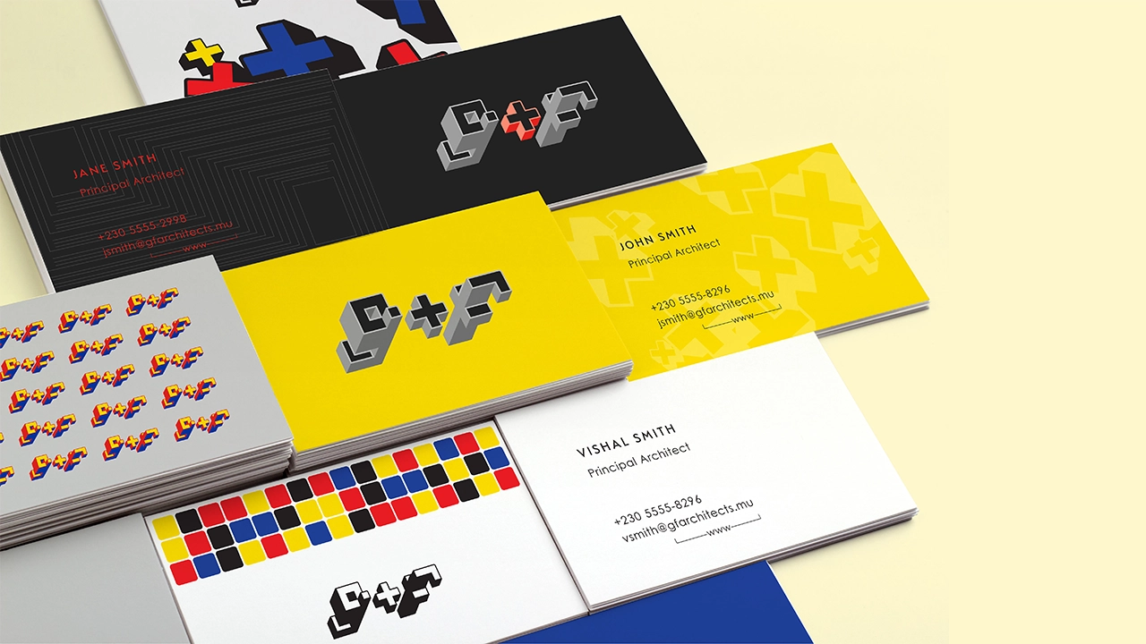
The G+F logo was built using a strict geometric system based on squares, 45-degree angles, and the rule of thirds. While the AF Kub typeface by Mauritian designer Jean Lou Désiré provided the conceptual starting point, the final logo was entirely reconstructed to align with these structural principles. The result is a design that feels engineered, thoughtful, and deeply connected to the mindset of architects.
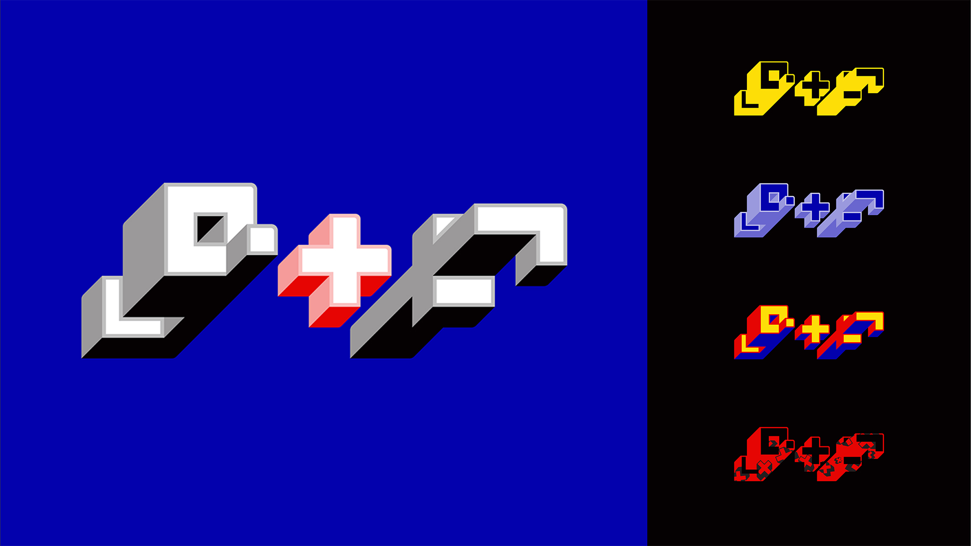
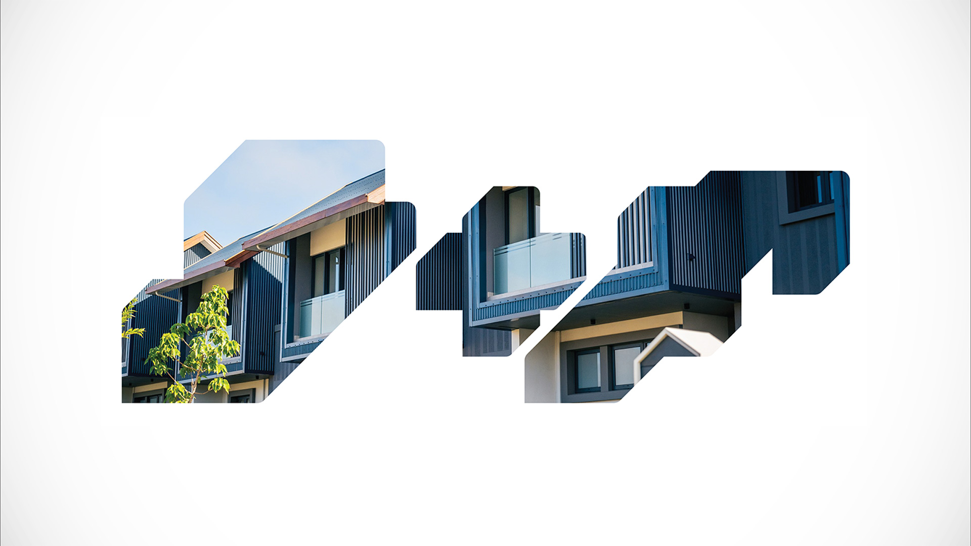
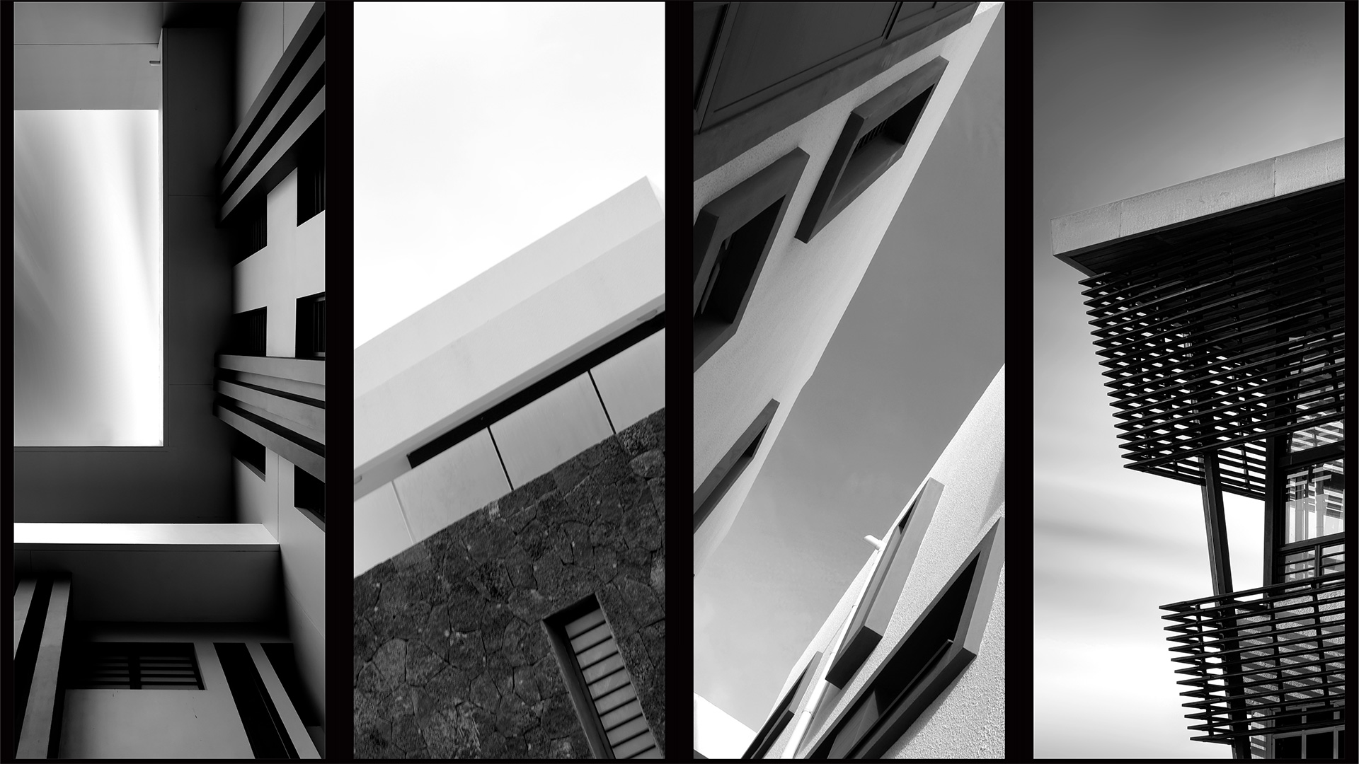
The logo’s isometric viewpoint, similar to architectural projection drawings, creates a bold and minimal shape that is both distinctive and memorable. Its unusual visual angle and modular structure offer numerous possibilities for variation in colour, texture, and application.
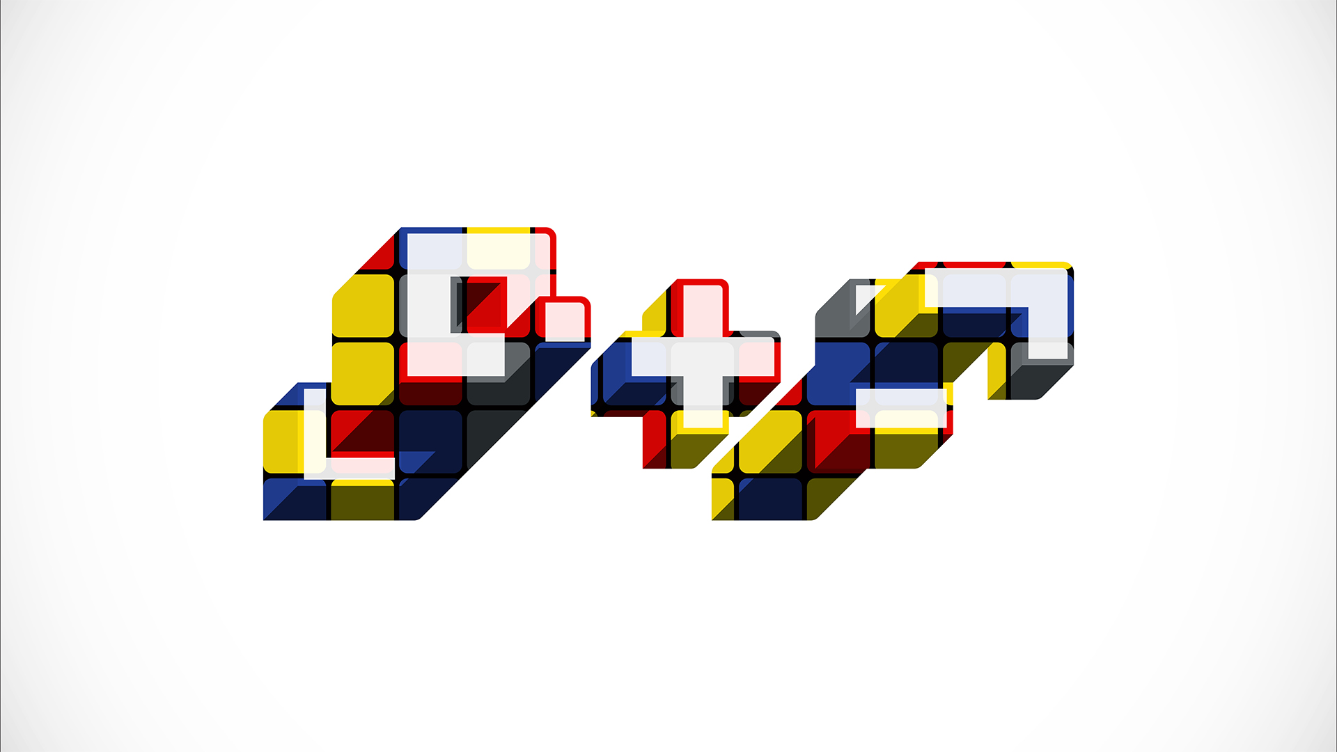
The brand’s colour palette is directly inspired by the Bauhaus school, using primary colours blue, red, yellow and solid black. These colours reinforce the brand’s connection to modernist ideals, while creating strong visual contrast and recognisability across all applications.
To expand the visual language, we created a custom scatter brush in Adobe Illustrator using the plus symbol found within the logo. This tool allows for the generation of dynamic, randomised patterns that remain connected to the brand’s core form. These patterns can be used across print, digital, or environmental design to add subtle texture, create branded surfaces, or bring motion into animated content. This solution introduces a playful layer within a system rooted in structure.
The identity system is designed for versatility. While the main logo appears on official documents, alternative versions can shift in tone, colour, and prominence depending on context. Whether highly visible or intentionally discreet, the logo adapts without losing its recognisability.
By combining Bauhaus design values, local typographic heritage, and architectural logic, the G+F identity presents a strong and future-facing visual language for the brand.