BerryMoon
Brand ID Design
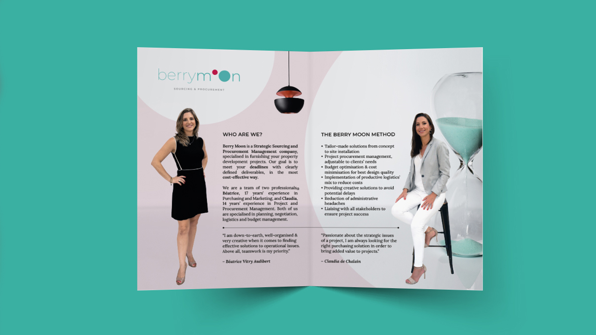
Beatrice and Claudia are two cousins who decided to merge their collective years of professional careers into a procurement and project management company. More specifically, a procurement and project management company specialised in real estate development.
Their core business model is to work alongside interior designers and take care of their furnishing and finishing procurement and supply needs. Up till the moment the brand was being created, this was the first company to offer these specific services to this industry.
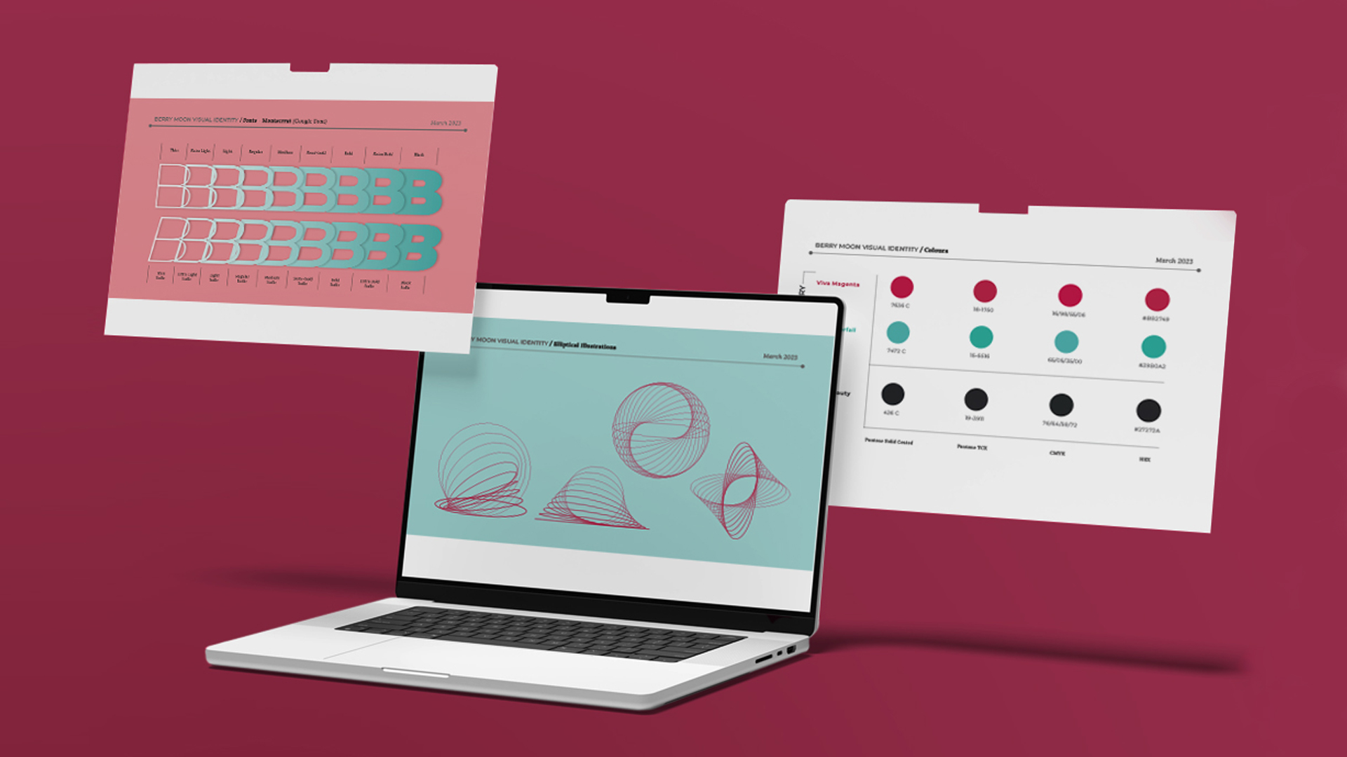
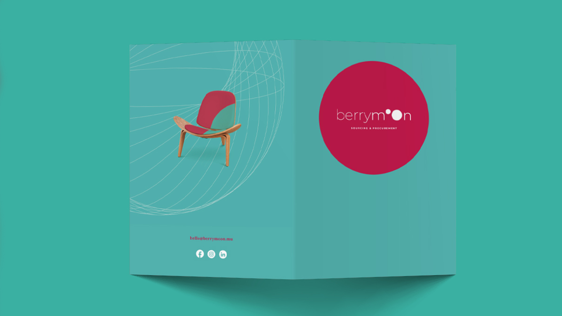
The brief was to name and design a brand identity that would highlight the main feature of the brand, which is its unique business model. As a concept, the interior design industry was portrayed as a planet, simply extrapolated from the common expression “ the world of… (add industry of choice). Using the company’s intention to act as a satellite resource to “the world of interior design”, the strawberry moon - full moon in June which appears which a pinkish hue - was chosen for the name and visual identity, concurrently defining the brand mark and the colour combination.